For any band or artist, having a strong web presence is key to your success, particularly when it comes to your website. In this piece we look what components make for a good website, and how you can work to improve yours.
____________________________
Guest post by John Hull of Soundfly’s Flypaper
We’ve got a brand new free course, made in partnership with our friends over at Bandzoogle, called How to Create a Killer Musician Website. And in the process of making it, we spent a ton of time looking at artist websites, and we’re pleased to share some quick information about what we think makes a big impact on potential fans. But first, here’s course instructor Delaney Gibson’s take.
In the above video, courtesy of the free course, Delaney highlights a few things of note. She recommends firstly that you do some thinking around who your audience is, and create eye-catching images that target that audience specifically. Your images tell a story about who you are, in the blink of an eye, and, more often than not, people will think you’re a boring artist if you have boring photos.
Secondly, Delaney reiterates some obvious points that she finds a lot of people forget about: Make sure you have a homepage and that it’s easily accessible. Make sure your tour dates and bio are clear because people go to your website looking for that information, specifically. And she recommends posting some or all of your lyrics on your website because it greatly helps your SEO.
The rest of the course goes into much more detail around why to build a website, how to fit it into your strategy, what info to include, and more, but one of the things that has jumped out for us the most is the sheer diversity of great sites out there. It’s pretty clear that there’s no one right way to create a perfect website, but there are some things that the best sites do that are worth pointing out.
1. The best sites stand out creatively.
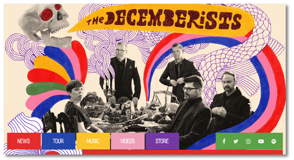
“Your website is another chance for your fans to fall in love with you.” That’s what Delaney told us, and it rings true. The sites that stick in people’s minds are the ones with spectacular imagery that leaps off the “page.” It doesn’t have to be complex, but it’s always a creative extension of the music in some way. For example, check out the crazy colors and whimsical storytelling on The Decemberists’ homepage.
2. The best sites communicate their brand.
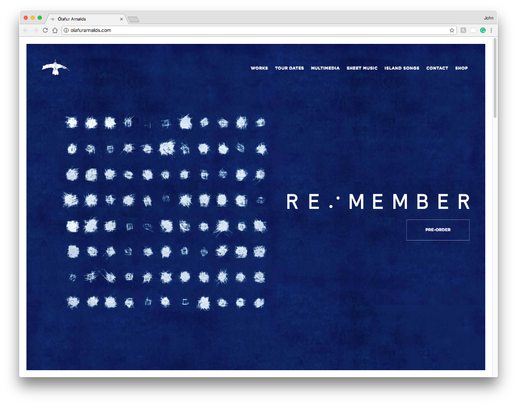
It’s not just images, though. It’s fonts, colors, language, videos — all of which add up to tell a coherent story about who you are and why people should love you. The best websites are a continuation of the story you’re telling through your music and what you stand for creatively. We love the way that Icelandic artist Ólafur Arnalds communicates his minimalist, sincere aesthetic through the imagery, fonts, and layout he uses.
3. The best sites have a single, simple message.
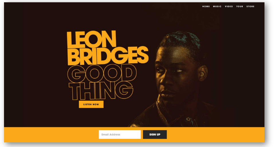
When you land on these sites as a fan, you know exactly what they want you to do. If the artist has a new release, it’s front and center. If there’s a release coming soon, they might have an email capture up front. But whatever it is, the sites that most effectively suck us in don’t require a ton of choices or decisions — they convey the most important information in the clearest way. Here’s how soul singer Leon Bridges did it in a way that got us listening to his music as quickly as possible.
4. The best sites are built with clear goals in mind.
Delaney was showing us the private page on her website that she made for industry folk, and it’s a really wonderful distillation of how a great website can further an artist’s career goals, if constructed effectively. She clearly knew that she wanted her website to support her outreach to labels, promoters, and press, so she prioritized that in how she built it.
5. The best sites start (or continue) a conversation with your fans.
Finally, the best websites create opportunities for the artist to communicate directly with their fans, be it through an email list, blog, Patreon page, or even just in the language and images the artist uses to communicate who they are and how the fans fit into their work. Great sites make fans want to be part of the conversation and then give them easy ways to join. The simplest way to communicate with your fans is probably through an email list, but you also want to make sure you have something to say that makes people want to sign up to that list.
What do you think?
What are your favorite artist websites? Let us know in the comments below! And go sign up for our free course to learn more about how to create an effective website for your music today.
Would you like a Mentor with that? Learn all about Soundfly Mentorship and how we can help you reach your musical goals in a month, or as long as you want to continue to improve!


