In this recent article from Chartmetric analyzing music data, their playlist analyzer takes apart the Spotify, Apple Music, and Deezer playlist ecosystems to help artists formulate optimal trajectory for their tracks.
_____________________________
Guest post by Nuttiiya Seekhao of Chartmetric
Artists and their teams understandably have many playlist performance questions:
“Given the current status of my track, what are the best playlists to target?”
“Given that my track got added to Breaking R&B on Apple Music, what other playlists usually happens to tracks on Breaking R&B around the same time?”
“Given that my track is currently on Hits of the Moment on Deezer, what are the odds of it getting on Les titres du moment?”
So in an effort to meet these needs, we built two main playlist analytics tools: the Pre-Playlist Analyzer and Post-Playlist Analyzer, which both look at a time-based concept we’ll call a song’s “Track Journey”. Both Analyzers look at the Track Journey of all songs on a target playlist, visualize the tracks’ commonly occurring playlists and display the percentage overlap between the playlists.
The Pre-Playlist Analyzer looks at the playlist data before each track gets on the target playlist, whereas the Post-Playlist Analyzer looks at what happened to each track after it got added.
We are capable of analyzing any playlist on Spotify, Apple Music, Deezer, Amazon, and YouTube, but for now, we will focus on a few of the patterns we discovered on Spotify, Apple Music and Deezer.
Spotify: Pop Rising
Let’s start with a Spotify frontline playlist from the Pop genre that constantly updates: Pop Rising.
What kind of journey did tracks take before arriving on this target playlist? To answer this question, we analyzed the historical data of 175 tracks that went through Pop Rising between a 30-day period (2019–06–14 to 2019–07–14), and identified the playlists that added those tracks in the past.
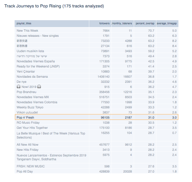
A few definitions: A “co-occurring playlist” is one that has one or more tracks in common with the target playlist. The “average_timegap” column denotes the average number of days between the date that a track got added to a co-occurring playlist, and date the track got added on the target playlist. The “percent_overlap” corresponds to the percentage of tracks on Pop Rising that appeared on each co-occurring playlist.
The obvious takeaway is the remarkable overlap between official New Music Friday (or new release-based) playlists, which orients us to the fact that Pop Rising is highly correlated with new music. It conceivably could have been a playlist that listed viral pop songs that got big on social media, but were not necessarily new releases.
We can also see that roughly 1 in every 3 tracks (31%) that made it to Pop Rising were added to Pop n’ Fresh (orange box) 3 days earlier (on average). Now that we know a little of what “feeds into” Pop Rising, let’s look at what happens to these tracks after Pop Rising.
The above plot shows the Post-Playlist journeys of tracks that got added to Pop Rising. Note that day 0 is the day the tracks got added to the target playlist. Tracks may have gotten added to the target playlist on different dates, so we time-shifted all tracks’ added date to align at day 0 for comprehensibility purposes.
The y-axis (labelled “Percent Overlap”) represents a percentage of how many tracks get added to a particular co-occurring playlist after getting on our target playlist. For example, the top line of the plot shows that about 33% of the tracks that made it to Pop Rising, later made it to It’s a Hit!
There are multiple data points to observe in this interactive chart: if you hover over each bubble, you’ll see basic playlist information as well as the number of tracks that were added at each “Time Gap”, or number of days after they got added to the target playlist (negative values are leading to the current target playlist, while positive values show Track Journeys after the target playlist). The opacity of each bubble represents how much track overlap happens at a specific Time Gap (darker = more overlap, relative to each co-occurring playlist). The size of the bubbles represent the number of followers each playlist has.
Notice that 17% of Pop Rising’s tracks end up on Spotify’s most followed playlist, Today’s Top Hits (TTH), at some point after. More specifically, most of this sequence happens within a week after the tracks were added to Pop Rising.
So while it’s certainly debatable if Spotify curators “vet” a certain track for likability before including it on a more popular playlist, if it does, it seems to happen quite quickly…even a matter of days.
Spotify: Hot Country
Next, let’s switch genres and apply the Playlist Analyzers to the top Country music playlist on Spotify: Hot Country.
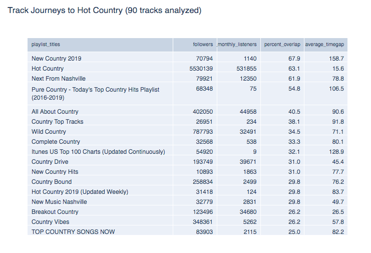
We naturally spot some genre-dependent co-occurring playlists like Next from Nashville, All About Country, New Boots, Wild Country, Breakout Country, but additionally find the genre-agnostic New Music Friday having significant track overlap with Hot Country.
This time however, we performed deeper Pre-Playlist Analysis on some of these co-occurring playlists themselves, and visualized the track flow between any two of them having at least 10% overlap.
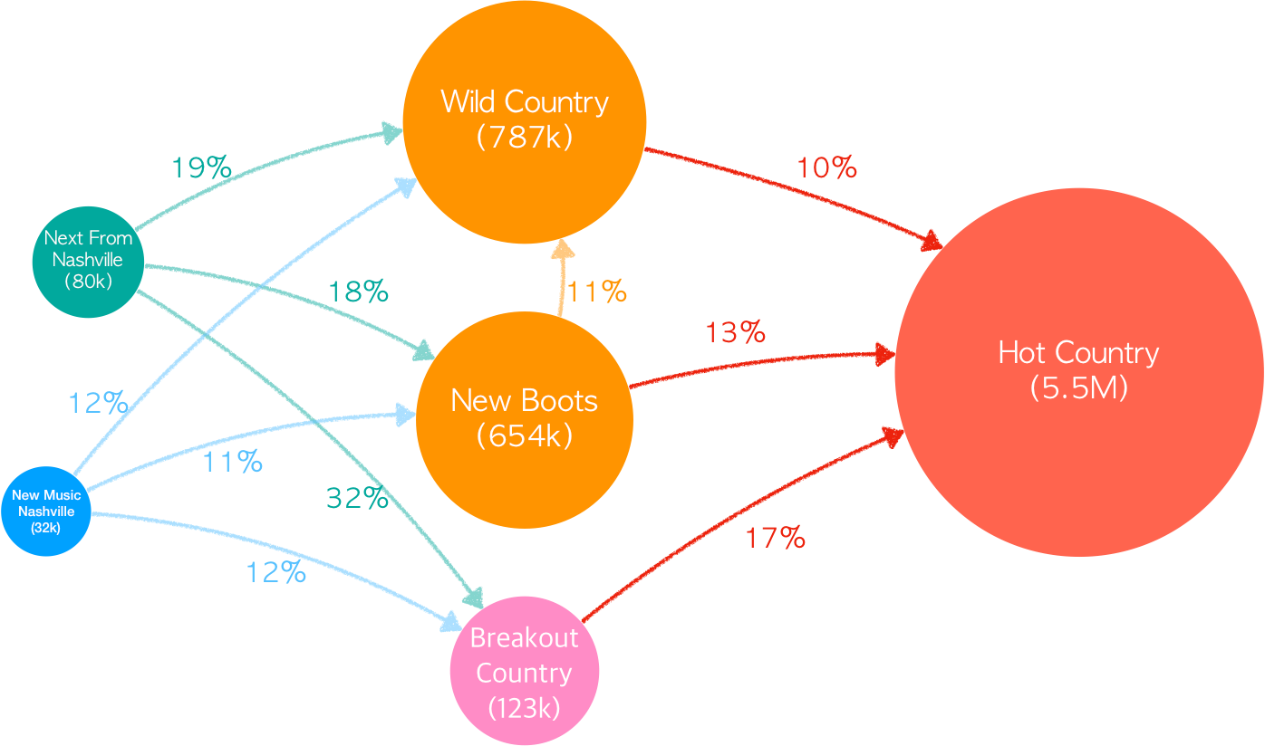
Even starting with the two of the most highly followed of the bunch, it still seems there is a relatively low chance of getting on Hot Country even if a track managed to get on Wild Country (787K followers, 10% chance) or New Boots (654K followers, 13% chance). Nevertheless, New Music Nashville (blue) seems to be a decent bet to get on either these six-digit follower playlists (popular playlists themselves), while Next From Nashville (green) is an even better one.
Despite Next From Nashville (NFN) having only 80K followers, roughly 1 out of every 5 tracks added to NFN made it to Wild Country or New Boots. Given that Wild Country and New Boots have more than half a million followers each, NFN seems to work well as a gateway to bigger country playlists.
We also see that 1 out of every 3 songs featured on NFN ended up on Breakout Country (123K followers), which itself is a great place for mid-tier playlist exposure. It’s certainly a sweet bonus that Breakout Country’s tracks themselves had almost a 20% chance of getting on Hot Country with its whopping 5.5M followers.
So if you’re an emerging country artist looking for lower-profile playlist within placement reach…why not try a playlist like Next from Nashville?
Spotify: Contextual Playlists
Another type of playlist that’s interesting to dissect are context-based playlists. These playlists tend to offer back catalog tracks more spins in the long run and focus on the user’s life context (e.g., going for a run, having a romantic dinner), rather than the music itself (e.g., rock music, Spanish-language music).
Let’s take a look at Spotify’s 3rd most-followed contextual playlist at the time of writing, Songs to Sing in the Shower at 5.1M followers. 🙂
From the above journey plot, you’ll see that there is a ~70% chance that if a track has already featured on Songs to Sing in the Shower (SSS)…it may be placed on it again later! While this may seem like an odd thing to point out, remember that tracks are constantly being added and removed from playlists.
So especially for a context-based, catalog-focused one like SSS that is frequently refreshed, music can find its way on and off at various times, which is great motivation for artists to get placed here for random (and welcomed) spikes of unexpected long-tail streaming revenue down the road.
Our Analyzer Tools differentiate these added/then removed/then added again event sequences from simply being on that playlist continuously. (Note that SSS is a “personalized” Spotify playlist which shuffles a larger list of tracks for each individual user, so we are using the default, public URL playlist version at all times.)
What’s also interesting is that there seems to be quite a few circular relationships between multiple Spotify contextual/mood playlists. This means that once a track places on SSS, it has a chance of bouncing from playlist to playlist and enjoy long term success.
Among the list of playlists that SSS has a tight relationship with, there are a couple that unsurprisingly stood out: Canta Sotto La Doccia and Canta en la Ducha, the Italian and Spanish translations of Songs to Sing in the Shower.
This would make sense, as Spotify has historically shown (at least in their Top 200 charts) that it does a great job of globalizing and keeping A-list English-speaking artist content front and center, as opposed to other platforms like Deezer that excel at showcasing domestic market content.
Despite both SSS and Songs to Sing in the Car (SSC at 8.6M followers) being highly-followed contextual playlists, the tracks landing on these playlists show very different journeys: for example, a significant amount of tracks seem to have appeared on many non-editorial playlists (such as Cleaning the House by curator “Dancing Playlists” at 87K followers) before ending up on SSC.
In contrary, tracks on SSS seem to have gone through mostly editorial playlists (such as Spotify’s Guilty Pleasures or Sing Through the Decades) before ending up on SSS.
For this reason, even though SSC has ~3.5M more followers than SSS, placing your music on SSC may well be the easier effort if you were to first pursue pitching to some of its “feeder” playlists like Most Popular Songs of All Time that are not controlled by Spotify itself.
As for SSS, if you are connected to Spotify’s curators, first pursuing smaller editorial playlists such as Happy Pop or Guilty Pleasures could potentially be an easier sell than getting your track on SSS directly.
Apple Music: The A-List: R&B
Let’s say we’re now interested in how to get a track on Apple Music’s top R&B playlist, The A-List: R&B.
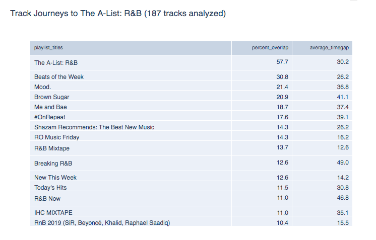
Using the Post-Playlist Analyzer, we looked at all co-occurring playlists with higher than 10% overlap. Note that we did not include major-label owned playlists in the analysis (Digster, Filtr and Topsify), though we did include Apple editorial playlists. For example, one of the playlists we analyzed was Apple’s Breaking R&B.
Notice that about 14% of the tracks that went through Breaking R&B got added to The A-List: R&B at some point later. Most co-occurrences happened within 10 days after the tracks appeared on Breaking R&B. By running the the same type of analysis on the rest of the co-occurring playlists described earlier, we compiled the results into the flow diagram below that summarizes the Post-Playlist journeys of all tracks on these co-occurring playlists (over 1000 tracks analyzed).
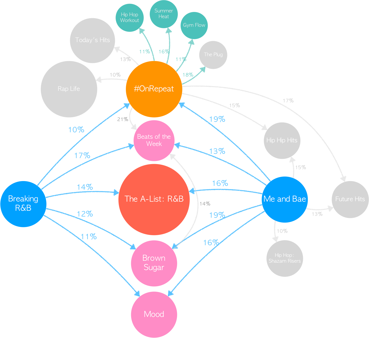
Roughly 14% and 16% of the tracks on Breaking R&B and Me and Bae got on The A-List R&B sometime later. Most of the co-occurrences happen within 7 days after tracks got added on these two playlists. More interestingly, the playlist adds on Breaking R&B and Me and Bae happened around the same time as other popular playlists such as Beats of the Week, Brown Sugar and Mood and #OnRepeat. For this reason, these playlists make good candidates for additional targets once your track made it to Breaking R&B and Me and Bae.
Additionally, Me and Bae and #OnRepeat have their own sets of playlists they co-occurred with frequently. As we saw earlier in the playlist analysis on Spotify, contextual playlists offer tracks continuing success by recycling them within the contextual playlists ecosystem. From this Apple diagram, #OnRepeat also has decent flows to contextual playlists such as Summer Heat and Gym Flow. So if Apple’s contextual playlists also draw lots of user consumption, getting on #OnRepeat can help establish a long-tail of streaming revenue for any artist lucky enough to get on it.
Deezer: Les titres du moment
Let’s say your ultimate goal is to reach Les titres du moment (LTDM), the most highly-followed playlist on Deezer (9.9M fans).
True to its reputation as a domestic-market first platform, most of the tracks on LTDM have gone through one of the editorial, market-based Deezer Chart playlists first. One exception would be the Track Journey through Hits of the Moment at 1.2M fans, one of the platform’s top playlists. Like before, we used the Playlist Analyzer tools and identified interesting Track Journeys leading to LTDM.
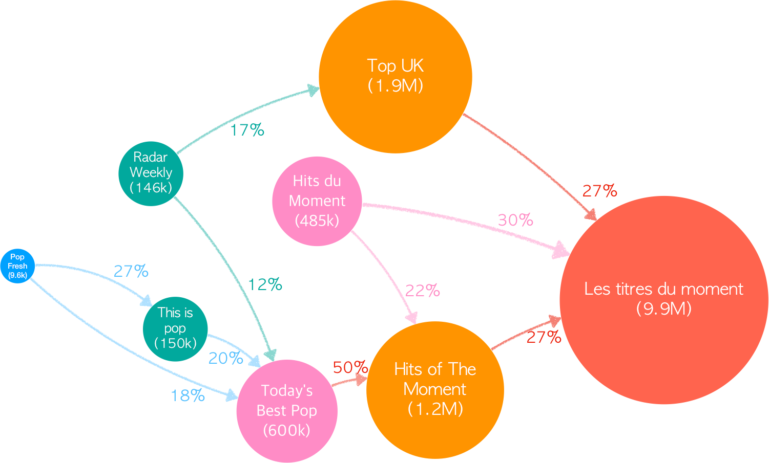
Before ending up on Hits of the Moment, the tracks have usually gone through one of the market-based Deezer Chart playlists, with the exceptions of Today’s Best Pop (600K fans), Hits du Moment (485K fans) and a few others.
Looking back further, Pop Fresh (blue node), This is pop (150K fans) and Radar Weekly (146K fans) seem to feed Today’s Best Pop (600K fans). So with only 9.6K fans, Pop Fresh is certainly worth investigating as low-hanging playlist fruit.
Given that 18–27% of tracks on Pop Fresh end up on bigger feeder playlists such as This is Pop and Today’s Best Pop, we may find here a few lower-profile “gateway” playlists that could lead your music to higher-profile ones.
The interesting patterns we discussed here are only the tip of the playlist iceberg! There is so much more to explore and we can’t wait to see what findings you will discover with these Playlist Analyzer tools.
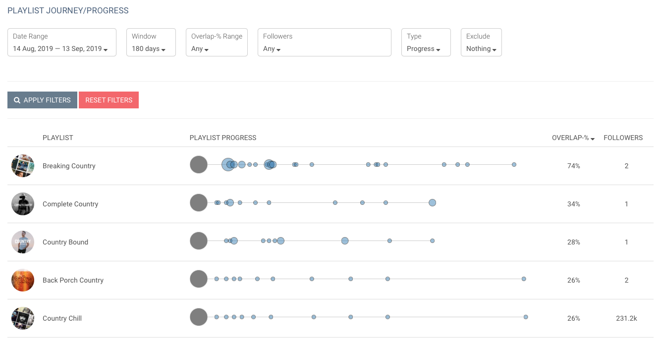
We will be making these tools live as Premium features on Chartmetric very soon. Stay tuned!
Do you dig data as much as we do? Let Rutger and Jason keep you in the loop on the music industry’s latest data gems by tuning into our podcast: Your Daily Data Dump.
If you’re interested, grab your free Chartmetric account here. We’d also love to hear from you at hi@chartmetric.com.