For artists and musicians, a website should act as a home base, providing interested fans with the most direct way of accessing you possible. Here we look at the best way to organize your site in such a way that interested fans are funneled into become paying customers.
____________________________
Guest post by Katherine Forbes of Soundfly’s Flypaper
Have you ever thought about why you have a website? If you can’t immediately come up with an answer other than “because everyone has one,” then this post is for you.
Not only is your website your home base online, it’s also your most direct opportunity to communicate with your audience. When people visit your website, they’re interested in you.
Here’s how to best take advantage of their rapt attention by strategically arranging your website content.
Create a Clear Call-to-Action (CTA)
You can’t sit back and hope fans magically find your new music in the merch store. Show them the way and give them a reason to click!
Pick a goal for your website. Just one. Here are a few ideas to get you started:
- Gain email subscribers
- Sell music
- Promote tour dates
For this post, I’ll use gain email subscribers as an example. Craft a clear call-to-action — in this case, something like “Sign up for our newsletter!” — to entice your website’s visitors to follow through and fulfill your goal.
Pro tip: Once you have access to fans’ emails, you can promote your music and tour dates directly in their inboxes!
Make It Obvious

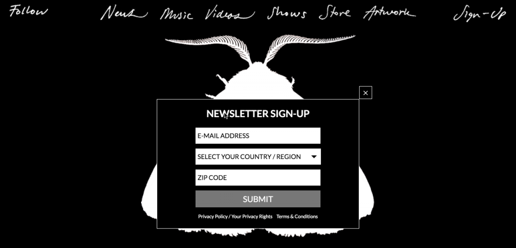
The mailing list sign-up screen on Chairlift‘s homepage.
Now that you’ve decided on your CTA, it’s time to communicate it to your visitors. The average person will spend only a few fleeting moments on your site, so make it very clear that you want him or her to subscribe to your email list.
To do that, add the sign-up form in multiple places on your homepage. That way, if someone gets scroll-happy, they’ll still see your CTA.
Here’s how:
- Enable an announcement bar at the top of each page linking to your sign-up page.
- Offer an incentive — for example, a free music download in exchange for subscribing.
- Add your sign-up box in the footer on each page of the site.
- Include “subscribe” or “free download” in your website navigation.
Keep Your Website Simple
In order to make sure people take action, keep the rest of your content simple. Don’t clutter your homepage with tons of options and social media feeds. Try this arrangement:
- Announcement bar linking to your sign-up page
- Navigation menu
- Large banner image(s)
- Social icons and sign-up button
- News posts
- Short quote or blurb about you
- Sign-up form in footer
- Social icons
- Navigation menu
Want to see this format in action? Check out sarahjarosz.com. Her website earns multiple email subscribers every day!